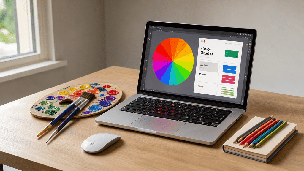
Color is an integral part of our daily lives, subtly influencing our emotions, decisions, and even perceptions. In the digital realm, this influence is amplified, making color a powerful tool in creating visually appealing digital spaces. Understanding and applying color theory can greatly impact various elements of digital interfaces, including mood, readability, and user engagement.
The Psychology of Color
The psychological effects of color are a fundamental consideration. Colors can evoke specific emotions and reactions. For instance, blue is often associated with tranquility and trust, making it a popular choice for projects aimed at fostering a sense of security and reliability. Conversely, red is energizing and attention-grabbing, often used to stimulate urgency or excitement.
These associations are not universal, however, and can vary based on cultural contexts, individual experiences, and personal preferences. Despite these variations, leveraging the psychological impact of colors can guide users' emotional responses and interactions within digital environments.
Creating Readability and Aesthetic Harmony
Readability is a cornerstone of an effective digital interface. Color plays a significant role in determining the legibility of text, with contrast being a key factor. High contrast between text and background enhances readability, making content more accessible. For instance, dark text on a light background is generally easier to read than light text on a light background.
In addition to readability, color contributes to aesthetic harmony. A well-thought-out color scheme can create a cohesive visual theme, unifying different elements of a page. Utilizing complementary colors—those opposite each other on the color wheel—adds vibrancy, while analogous colors—those next to each other—can create a more calming effect.
Engaging Users Through Color
Beyond aesthetics and readability, color affects user engagement. Strategic use of colors can guide user actions and enhance the overall user experience. For instance, call-to-action buttons often use warm colors like orange or red to stand out and prompt user interaction.
Furthermore, color can assist in building hierarchy and focus. By directing users' attention to specific elements, such as notifications or error messages, designers can prioritize information seamlessly.
Adapting to Modern Trends
In recent years, digital spaces have seen a rise in the use of muted and pastel colors, often reflecting trends in minimalistic design. These softer tones create a sense of calmness and simplicity, aligning with the preferences of a user base seeking aesthetically pleasing and less intrusive experiences.
Conversely, there’s an increasing adoption of dark mode, which leverages darker colors to reduce eye strain. This trend showcases the evolving nature of digital aesthetics, adapting to technological advancements and user needs.
Conclusion
In the intricate tapestry of digital spaces, color weaves a narrative that goes beyond surface-level aesthetics. Understanding and applying color theory is crucial to crafting engaging, readable, and emotionally resonant experiences. As technology evolves and design trends shift, the role of color will continue to underpin the way digital spaces are experienced, ensuring that they meet both functional and emotional needs.