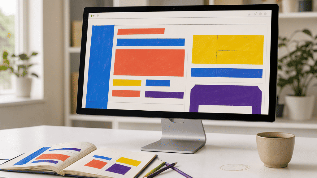
In the ever-evolving digital landscape, the ability of a webpage to captivate an audience hinges not just on functionality but significantly on its aesthetic appeal. A well-crafted visual presentation can determine whether a visitor remains engaged or moves on to a competitor. Delving into the fundamental principles of layout harmony, color theory, and typography reveals how aesthetics can enrich the user experience and enhance audience retention.
Layout Harmony
The structure of a webpage is akin to the blueprint of a building; it requires thoughtful arrangement to be both intuitive and visually pleasing. Layout harmony is the principle of creating a seamless and balanced arrangement of elements that guides the viewer’s eye naturally through the content. By employing grids and alignment principles, designers can create a cohesive flow that not only makes information accessible but also aesthetically pleasing. For instance, the thoughtful use of white space can help in reducing visual clutter, making it easier for users to focus on key messages without feeling overwhelmed. A harmonious layout not only improves usability but also lends a professional feel that reflects an organization’s brand identity effectively.
Color Theory
Color is a powerful tool that evokes emotions and influences perceptions. Understanding color theory is essential in designing a visually appealing interface that resonates with the target audience. Colors can be used to guide users' attention, create visual interest, and convey meaning. Warm colors such as red and orange can evoke feelings of warmth and excitement, while cool colors like blue and green tend to calm and soothe. A well-thought-out color palette can enhance brand recognition and improve readability and navigation. Complementary colors can draw attention to call-to-action buttons, while analogous colors can create a harmonious and cohesive look. The psychological impact of color should not be underestimated, as it can significantly influence a user’s perception and engagement with a site.
Typography
Typography—the art and technique of arranging type—plays a crucial role in communication. It can set the tone for the content, creating an emotional connection with the audience. Selecting the right typeface and size can increase readability and accessibility, especially for long-form content. Consistent typography across headings, subheadings, and body text contributes to a structured and organized layout, helping users to easily scan and digest information. The choice between serif and sans-serif fonts can convey different aesthetic values: serifs often suggest tradition and reliability, while sans-serifs tend to represent modernity and simplicity. By paying careful attention to typography, designers ensure that the text is legible and engaging and supports the overall message effectively.
In conclusion, aesthetics in page design are pivotal in engaging and retaining an audience. Through strategic attention to layout harmony, color theory, and typography, designers can create visually appealing and user-friendly experiences. The artful blend of these elements not only attracts visitors but also communicates a brand’s message with clarity and elegance, ensuring the page leaves a lasting impression. As digital spaces continue to grow and compete for users’ attention, understanding and implementing these aesthetic principles can provide a significant advantage in capturing and maintaining audience interest.